The brief
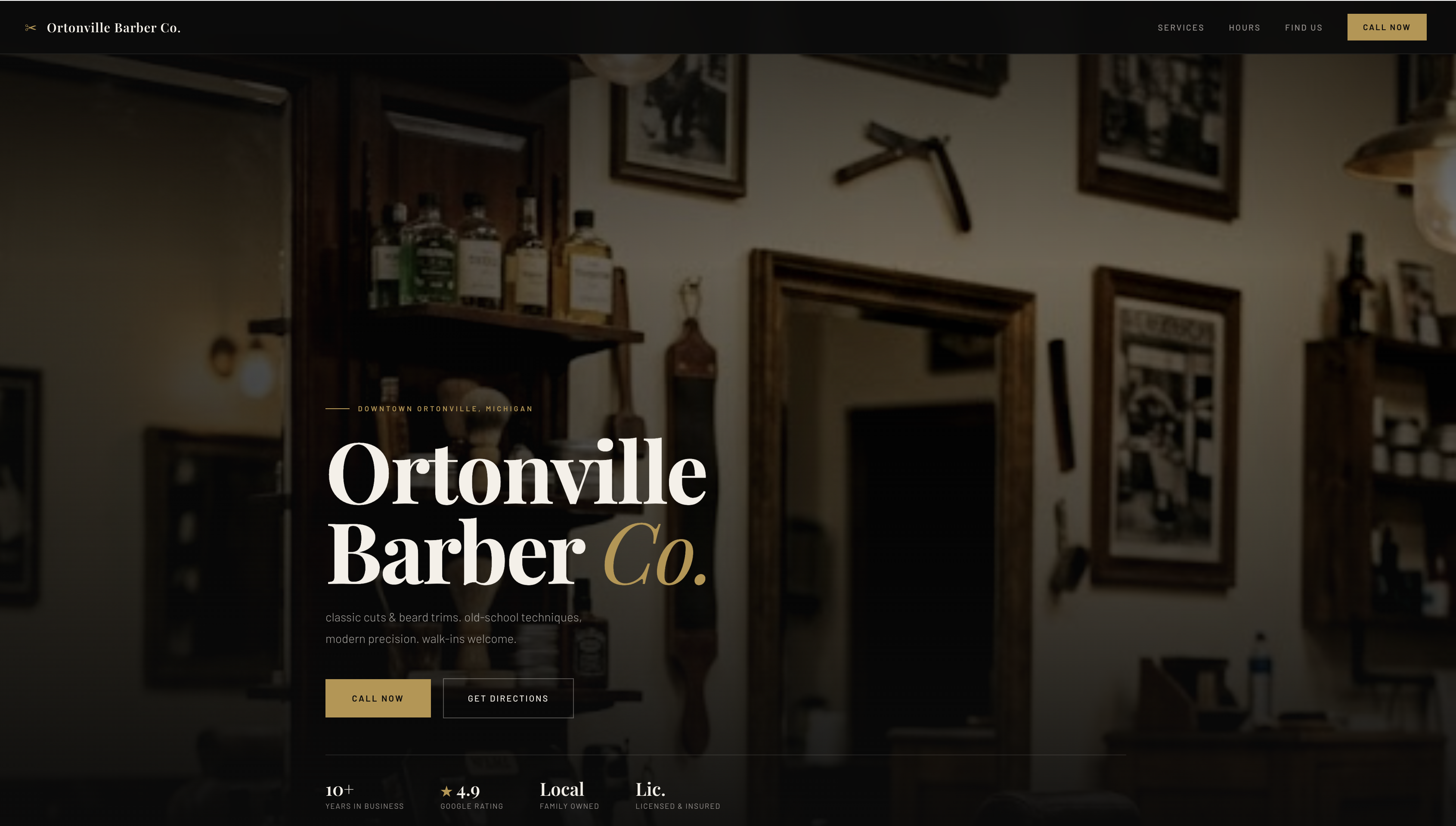
A barbershop needs a website that feels like the shop — dark, sharp, confident. The kind of site a new customer lands on and already knows they're in the right place.
Most barbershop websites use the same template. This one was built around the shop's own aesthetic so new customers can see services, pricing, and hours at a glance — and know how to call in a few seconds.
Design direction
Dark charcoal base, muted gold accent, cream type. The same contrast you'd find in a classic shop: dark walls, brass fixtures, warm light. The site feels like the space before a customer walks in.
What was built
each section appears as the visitor scrolls down. keeps the page feeling intentional instead of a wall of content hitting them at once.
a clean grid that lets the shop's cuts speak for themselves. hover to see labels. no stock photos, no filler.
a gold button fixed to the screen follows the visitor the entire time. they never have to scroll back up to find the number.
four feature cards — hot towel, precision cuts, beverage of choice, kids welcome. builds trust before the visitor sees a price.
all services and prices visible at a glance. no "call for pricing." customers know what they're walking into before they reach out.
four reviews with stars and initials. social proof right on the page — no widget, no slow load, no third-party dependency.
a large typographic watermark sits behind the craft section — barely visible, but adds the kind of depth that separates a designed page from a built one.
the whole site reflows cleanly on mobile. most customers find local businesses on their phone — the site is built for that.
What makes it different
fast by design. no third-party tools, no bloated builders. the whole site loads in under a second on a slow connection. for a local business, that matters — most visitors won't wait.
built to hold up. even if the hero photo fails to load, the site doesn't break. the background is a designed fallback — warm, intentional, on-brand. the site looks right in every state.
The result
A site that feels like the shop before a customer walks in. The call button is always visible. Pricing is clear. The experience is shown, not just described.
Conversations have shifted from "what do you offer?" to "can you get me in?" — customers arrive already knowing what they want.
view live preview ↗